We’d like to introduce Stefan Chinoff who is the designer responsible for the visual identity of ONE DANCE WEEK 2016. He is interested and has been working in the fields of design, typography and illustrations and has already participated in a lot of creative projects – Plakat Kombinat, Spirit of Burgas, Temper Boards, and also the gigantic Wired Magazine, Burton, Nike, BBC. Stefan is just as wonderful as his artistic style. You can take a closer look at some of his moments here and also browse through his Behance.
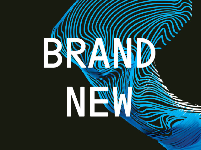
We were eager to share more of him and his work on the visual identity of ONE DANCE WEEK 2016. As you may already know, the visuals used by Stefan this year were also a part of our identity in 2015 – created and adapted by Noble Graphics and acknowledged with a bronze prize for in the Press Advertisement – Social, Politic, Media category and a silver prize for the Design and Text. Art Direction category during #ФАРА2015. After all our favourite designer remade them and looked at them though a brand new point of view – one which is definitely more magnetic and more electric, but keeping the traditional blue festival colour. The main accent and inspiration for him were the vibrations – music, dance, but also human. They are the content underneath the form of contemporary dance (scene design, music, rhythm, light design, choreography, etc.) and every single person feels them in his own and unique way, sometimes they keep you on your toes, sometimes they scare you and all you can do is choose between running away from the performance and letting yourself go.